Envato Tuts+ Tutorials |
- How to Generate APK and Signed APK Files in Android Studio
- How to Fix a 500 Error on Your WordPress Site
- 20 Best One Page Website Templates With Responsive Designs for 2021
- 10 Creative Ways to Design Your 'Save the Date' Cards
- How To Fix Outlook Dark Mode Problems (Email Design)
- 9 Best AI Plugins for WordPress and WooCommerce for 2021
| How to Generate APK and Signed APK Files in Android Studio Posted: 29 Aug 2021 03:08 PM PDT Android Studio allows you to create two kinds of APK files. First are the debug APK files that are generated solely for testing purposes. They will run on your Android mobile. However, they cannot be uploaded to the Play Store or made available for the public. Secondly, you can generate signed APK files. Signed APK files come in handy when you have tested your application and it is ready to be uploaded on the Play Store and released to the general public. This tutorial will show you how to create an Android app by generating APK files using Android Studio. First things first, open up a project file in Android Studio. If you don't have a project file yet, simply create a New Project. Creating an APK fileGenerating a debug APK file is easy and is a matter of just a few clicks. First, open up your project or application that you're willing to import into an APK file. Then, select Build > Build Bundle(s)/APK(s) > Build APK(s) from the toolbar menu.
Android Studio will take a few moments to generate an APK file. Once the APK build is complete, you'll receive a notification on the bottom right corner of your screen. From that notification, select Locate and you will be led to the APK file location.    In case you miss the notification, you can still locate the APK file in the following path within your project folder: app/build/outputs/apk/debug. The file is named app-debug.apk by default. Creating a Signed APK FileFor generating a signed APK file, open the Build menu from the toolbar and select Generate Signed Bundle/APK. 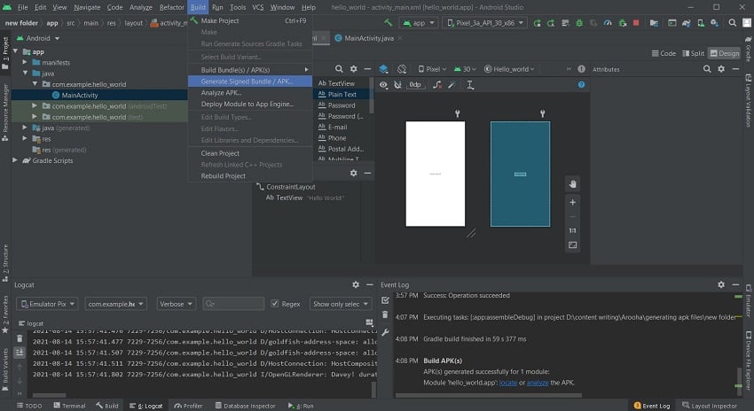   This opens up a screen where you have to select between creating an Android App Bundle and creating an APK file. Check the APK radio button and proceed to the next window.   On the next window, you will be shown the module (your application) for which the APK file is being generated. You'll be asked about your Key store path, Key store password, Key alias, and the Key password.   Creating a New Key StoreAssuming that this is the first time you're creating a Signed APK file, you will have to create a new key store. Keys are used by the developer to access their application once it has been uploaded to the Play Store. The need for the keys usually arises when you have to update your application. All of the keys are stored in the key store. Both the key store and the keys are protected by passwords of their own. The passwords should be at least six characters in length. Also, it is a good practice to keep multiple copies of your keys since they are your only gateway to your application. If the key is lost, you will not be able to access your application or update it. Creating your own app requires you to create a new key store. To do so, select Create new. You will find it underneath the input field where you enter the key store path.   You will then be redirected to a new window.   In the new window, enter the path for your new key store, and then enter a password to protect it. In the same window, you will also be setting a new key for your application. Enter an identity for your key in the key alias field and then enter a password for it. You can keep the same password as that of your key store, however, it is a good practice to give a new password to each of your keys. The same goes for the key alias. The next field defines the validity of your application. This is the duration after which the key to your application will expire, leaving your application inaccessible. The default validity for a key is 25 years. For each key that you generate, you're given a certificate that contains all the information about you and your company. You do not necessarily have to fill in all the details except the ones you feel like should go on your certificate. A key will still be generated even without filling each field of the certificate. Finishing UpOnce you have filled in the details for the certificate, select okay. You will then be directed back to the Generate Signed Bundle or APK screen. Here, all of the fields will now be pre-filled for you. Go through all the details to stay on the safe side. Then, select Next.   On the last screen, you will be now be able to see the destination of your Signed APK file. Below that, you will see two more options: Debug and Release. Debugging is used when the application is still in the testing phase. Since your application has passed the testing phase and is ready for deployment, select Release. There are two more checkboxes towards the bottom of the screen. Select V2 (Full APK Signature) and click Finish.   You will be notified by the Android Studio once the APK build is finished. Now, you can click on Locate from the notification to open up the file location. The Signed APK file is named app-release.apk by default. You will find it in your project folder in the app/release directory. SummaryThese are the steps you need to follow to generate APK and Signed APK files for the purposes of testing your app and making it downloadable via Google Play respectively: Create a APK File
You can now transfer your debug APK file it to your Android mobile phone and test it for bugs. You can also test it out on your PC using the Android emulator. Create a Signed APK File
Create a New Key Store and Key
You can now release this signed APK file to the public by publishing it on Google Play Store. Easy but tricky, right? Hopefully, this tutorial helped to debug any confusions you had about generating APK and signed APK files and bettered your understanding of both file types.  |
| How to Fix a 500 Error on Your WordPress Site Posted: 29 Aug 2021 07:08 AM PDT A website can suddenly stop working for a variety of reasons. Successful requests for a website usually give a status code of 200. One of the first things that we can do when a website isn't working is to find out the status code returned by the server. This might not always lead you directly to the root cause of the problem but it can sometimes help in determining the next series of steps that you can take to get the website up and running again quickly. In this post, you will learn how to fix a 500 error on your WordPress website. What is a 500 Error and What Causes it?A 500 error basically means that the server has come across an unexpected situation that it didn't know how to handle. As a result, it either serves users with either a 500 error page or a completely white screen. The explanation doesn't help us much but there any some common things that can cause this error. Here are some examples:
Fixing a 500 Error on WordPress WebsiteNow, we will briefly go over the steps that you can take to resolve any errors caused by the issues mentioned above. Let's get started. A Corrupt .htaccess FileAny misconfiguration of the .htaccess file can potentially cause a 500 error. You should consider reading this getting started guide on .htaccess to learn more about this file if you aren't already familiar with it. The easiest way to fix it is to take a backup of the current .htaccess file and then delete it from your server. You can usually find it in the root directory of your WordPress hosting account.    Make sure you download the file first before deleting it. This will allow you to upload it back in case the .htaccess file wasn't causing the error. Try visiting your website after deleting the .htaccess file. If deleting the file resolves your 500 error, you can generate a fresh .htaccess file by visiting Settings > Permalinks and then clicking on Save Changes. Otherwise, simply upload the old .htaccess file back on your server.    Faulty or Incompatible PluginsSometimes the plugins or themes that you have installed can result in a 500 error either due to some incompatibility or other faulty code. The best way to resolve any errors caused due to this incompatibility is to simply deactivate all the plugins and then see if you are still getting the 500 error. If deactivating all the plugins solved the problem your you, then this means that one of the plugins is causing the 500 error. Now, you can start activating each of them one by one to see if which of them is at fault. Keep checking the website for a 500 error after activating each plugin.    If activating a plugin shows you a 500 error, you can contact the plugin developers to let them know about this issue so that they can fix it in the next update or suggest a quick fix. Limited PHP MemoryAlthough rare, it is possible that you are getting a 500 error because something inside a theme or plugin is exhausting all your allocated memory. One quick fix for this is to simply increase the memory limit. Open the .htaccess file that you learned about in the first section and place the following lines inside it. php_value memory_limit 512M php_value upload_max_filesize 64M php_value post_max_size 64M It would be better to place them just before    Remember that this is just a temporary quick fix. The ideal solution would be to find out what exactly is causing this spike in memory use and then fix that function inside the plugin or theme. Otherwise, you will run out of memory again sooner or later. Corrupted WordPress Core FilesIt is highly unlikely that a corrupted WordPress core files could be causing a 500 error on your website. However, this fix is worth a try if none of the above resolved the error for you. What we are trying to do here is replace the core WordPress files for two directories called wp-admin and wp-includes. You shouldn't be making any changes to the contents of files located inside these directories as they are used to keep WordPress functional. Changing anything there either intentionally or unintentionally can result in a 500 error. The first step is to visit the WordPress download page and get the latest version. After that, you can extract the contents of the downloaded file and replace the files inside wp-admin and wp-includes directories in your WordPress installation with these fresh unaltered copies using your FTP client. Final ThoughtsIn this post, we mentioned four different reasons that might cause a 500 error on your WordPress website and briefly explained how you can fix each of them. Hopefully, one of these will resolve the 500 error. Consider contacting your webhost to get some additional help if none of the steps mentioned here worked for you.  |
| 20 Best One Page Website Templates With Responsive Designs for 2021 Posted: 29 Aug 2021 05:55 AM PDT Most websites use a multi-page structure to organize their information and include all the details about a company, business, or a person. But websites can be simplified dramatically and be just as effective—or even more so.    You can make a targeted website with a single page design and present all your relevant information more concisely. In some cases, a one page website is exactly what you need to showcase your new product or service. One Page Websites Are Quick to Make and Highly TargetedThe benefit of a one page approach is that visitors can get all the information they need quickly. They don't have to click through an enormous number of pages that would slow them down. With a single page site design, it's easier to target your audience and lead them to a desired action. It also allows you, as the website owner, to cut out all the fluff and make your new site fast. This is especially great if you're on a tight deadline to launch a new website for a company or marketing initiative. Envato Elements is the best place to download one page responsive website templates. For a low monthly fee, get as many one page website templates as you need in our subscription-based marketplace.    This is a great offer if you're a web designer with many clients and you need to get the best one page templates for your projects. In this article, we cover what key features are found in top one page HTML site templates and highlight the best one page website templates from our marketplaces. 5 Best One Page Templates From Envato Elements to Download in 2021Next up, I'll show you some of the best one page templates from our subscription-based marketplace. Browse through these great one page site templates to find the best design for your next project: 1. Minimalize - Minimal Multipurpose One Page Template   Minimalize is a stunning single page website template. With an attractive minimalist design, this one page site template is fully responsive, flexible and customizable. Check some of its best features:
2. Misto - One Page Portfolio Template   If you need a single page HTML template for your portfolio, Misto is a great option. It's one of the best single page website templates because it's easy to customize and has a clean design. Check this fully responsive template with HTML5, CSS3 and W3C valid HMTL code. 3. Volos - One Page Resume HTML Template   One page templates are a popular option for online resumes. Volos is a nice and modern single page website template that'll work great for your resume. These are some of its best features:
4. Revo Studio - Agency One Page HTML Template   Revo Studio is a great single page business website template. This one page HTML website template comes with four homepage styles, Mailchimp integration, valid HTML 5 code. It's fully responsive and easy to customize. 5. Rival One Page V-card Template   Use this fantastic single page HTML template to make your next virtual card, portfolio or online resume. You can also use this one page template as a mini website for a small company that wants to be introduced quickly and without fuss. This one page responsive website template is fully responsive, retina ready and features clean HTML5 and CSS3 code. Envato Elements (Design Without Limits)   Envato Elements has a fantastic (all inclusive) offer: Sign up for Envato Elements. You'll get access to thousands of creative graphics and templates (with unlimited use). Choose from the best single page website templates, professional presentation templates, awesome fonts and photos, and more — all for one low monthly price.    That's right! Download as many one page templates, graphics and royalty-free audio as you want, then customize them to fit any of your project needs. While Envato Elements is a powerful option, if you prefer to buy a new single page HTML template one at a time (instead of getting unlimited access to hundreds of creative designs), check out the selection from our Envato Market below. 15 Best One Page Website Templates from Envato Market (Buy One at a Time)Here we curate 15 of the top one page HTML website templates that have the powerful features you need. Use them for business websites, resumes and personal sites, as well as coming soon and multipurpose templates that can be used for any occasion. Check our best single page websites from our Envato Market: 1. Biz One - One Page Parallax Website Template   Biz One is an elegant business and portfolio site template with many layout options. You can use a stylish slider or a video background to showcase your services. Opt for a parallax layout if you want your website to have an extra visual appeal. There are plenty of sections to showcase your services along with pricing tables, past projects, and your business partners and coworkers. This one page responsive website template is rounded off with a stylish and fully working contact form. 2. Wharhol - Modern HTML One Page Website Template   The best one page websites are made with great designs. Consider the Wharhol template if you love typography and want a website that features gorgeous font combinations. The responsive HTML one page site template allows you to get creative and build the perfect website for your needs by pairing different element blocks. You'll also get beautiful navigation menus and many layouts so you can create a business-oriented site just as quickly as an e-commerce site. 3. GodLike - Dark One Page Gaming Website Template   If you're a gamer looking for a responsive HTML website template, be sure to check out GodLike. The one page site template allows you to show your game, create a community with a clean forum design, or use store layouts to sell gaming related goods. You can share blog posts and gaming news, too. The 1 page template also includes unlimited layout variations and various shortcodes such as carousels, video blocks, and progress bars. 4. StudioX - Creative One Page HTML Parallax Template   Try out the StudioX HMTL site template if you're a creative agency or a freelance designer. The one page template has a clean parallax design with several layouts available and easy to customize sections to feature your past projects, client testimonials, and services. Use call to action buttons to encourage potential clients to contact you and take advantage of the Contact section featuring a Google Map so they can find your business location. This is a great single page business website template for your project. 5. Bizcon - Simple Multipurpose HTML Site Template   Bizcon is a 1 page template that features a simple yet elegant design, perfect for a small business or a creative agency. The one page site template comes with several layout possibilities and unlimited colors. Create beautiful sliders to promote your past work or services thanks to the integration with Revolution Slider. Various sections can be used for portfolio, skills, testimonials, team members, and a stunning contact form along with a Google Map. 6. Sphene - Multi-concept One Page HTML Site Template   The Sphene one page HTML template is an excellent choice for any business website that wants a fresh design with the ability to add a background video and unique animations for extra visual appeal. In this single page business website template, there's plenty of room to describe what your business has to offer. The 1 page template includes well-documented code that's easy to customize. You can also use icons to highlight your services as well as choose between a sticky or off-canvas menu. 7. Juno - Magazine and Photography One Page Template   Opt for the Juno one page website template if you're a photographer or a journalist in need of a web presence. The one page HTML template has many layout variations geared for photography and magazine websites. It includes 11 color schemes to choose from. The best one page websites are made with great designs and properly coded. This template has also been coded with the best SEO practices in mind and, naturally, looks stunning on all screen sizes. 8. Wedding - Responsive Single Page HTML Site Template   If you're planning a wedding and need an elegant template for the big day, consider using Wedding. This one page responsive website template comes in several unique and romantic styles that are perfect for sharing the details about the upcoming nuptials. You can use a parallax or video background and share the time and day of the event along with a gift registry and an RSVP form. There's also a section for blog posts so you can keep guests up to date in the days leading to the big event. 9. Unity - Flexible All In Single Page HTML Website Template   Unity packs quite a punch under the hood, with more than 30 demo layouts and over 100 PSD files included. The Unity responsive HTML template comes in many color schemes. Use it for a variety of websites, from small business sites to portfolio and agency websites. Aside from including sections for services, portfolio, testimonials, and calls to action, the template also offers various header layouts and some extra layouts for an online store or a blog. 10. Desmond - One Page Resume/CV Website Template   Desmond is a great choice for anyone looking for a one page resume site template. Introduce yourself right in the header area with a profile photo and contact information. Then wow potential employers with a showcase of your skills, education, experience, and past projects. Add social proof with testimonials and ensure employers can reach you through the contact form. The template includes a light and a dark version, and you can create your own color scheme. 11. Legendary - Innovative and Versatile One Page Template   The best one page websites are made with easy to use features and great designs. This HTML site template was designed to put your brand into main focus. It features a clean design with plenty of white space. This is perfect for bringing attention to your work and your content. Include stunning images of your team, past projects, your product, or anything else you might use the template for. It comes with several unique backgrounds and beautiful animation effects as well as several different layouts. 12. Fin - One Page Under Construction HTML Site Template   If you're not quite ready to launch your website, then Fin is the perfect responsive HTML template for you. It's made as an under construction template, allowing you to grow your social media following and your email list while you work on your site. The subscription form integrates with MailChimp. The template has many background options and demo variations so you can choose the one that best fits your brand. 13. Minimal - Clean and Minimalistic One Page Template   Like the name suggests, the Minimal one page website template features a clean and simple design. On top of a simple design, it's easy to customize and edit thanks to the code blocks that you can simply copy and paste. The best one page websites have beautiful designs, with a clear message, and are simple to use. 14. ePoint - Sleek and Intuitive HTML Site Template   Built on top of Bootstrap, the ePoint one page HTML template looks great on any screen size and caters to corporate and business websites. Several different layout variations are included with the one page site template. Share all the important information about your company with ease. You can also use video or a parallax background and use MailChimp integration to grow your email list effortlessly. 15. Khaki - Multipurpose Single Page Website Template   Use Khaki one page responsive site template for many different purposes. It comes with a whole slew of interesting features such as integration with MailChimp and social media networks, a fully functional contact form, shortcodes, sliders, and many other elements that'll make your website stand out. Smooth animations and parallax effects add extra visual appeal, and you can even embed audio on your website. 5 Quick One Page Website TipsMaking a one page website seems simple at first glance, but if you're not careful with how you present and organize your information, it can quickly turn into a jumbled mess. You've seen our best single page website. Now, here are five best practice tips to help you create a stunning one page website. 1. Ensure Images Appear Crisp and Resize ProperlyOne page websites are known to use full-screen background images. They break down the page and serve as a visual guide to denote different sections. As such, it's imperative to ensure your images aren't blurry and that they aren't cut off on smaller screens. 2. Include Multiple Calls to ActionForgetting calls to action may be the biggest mistake you can make. After all, sharing all the information will be useless, unless you tell the visitors what you want them to do. Sections for visitors to get in contact with you are the perfect call to action, like we see in the template below. So, use them and let visitors know what they should do.    3. Be Clear and Succinct in Your CopyWith limited space available, take care to use a clear and direct message. Include the necessary information about your company and the services you provide. Avoid including unnecessary information or consider using a video to share more details. 4. Make Your Navigation Easy to UseNavigation is one of the most important elements on any website, that goes for one page sites as well. Make sure all the sections are included in your menu so visitors can easily jump between sections. Be sure to use a sticky menu, like the one featured in the Sphene template, to have your navigation always accessible. 5. Provide Social Proof With TestimonialsYou've got less space to convince a potential client that you're the right person for their project with a one page website. Using testimonials is an excellent way of showing your expertise and letting them see that others have had a pleasant experience working with you.    5 Web Design Trends For 2021The tips above are a great way for your website to have a professional and polished design. But to stand out in your niche it's a good idea to incorporate web design trends into your website. Here are five design trends to keep in mind as you're working on your website: 1. Minimalist Design   One-page websites go well with minimalist design. Plenty of white space, minimal text, and minimal color palette do wonders for making your content stand out and allow visitors to focus on what's important. The Eleos template is a great example of minimalist and clean design in action. 2. Fun AnimationsMake your website more dynamic by adding some fun animations. Parallax is a great way to add visual interest. But you can also animate individual images and text if you're not a fan of moving background. 3. Focus on Visuals   Visuals aren't limited to photos alone, although they make up the majority of visual content. Think about icons and fun illustrations you can add to your website to add a touch of personality. The Montero template is a great example of using visual elements to stand out. 4. Bold ColorsWhether you use them for call to action buttons or as a section background, bold colors help draw the eye of your visitors and guide them towards taking the desired action. 5. Clean, Simple Fonts   As you can see from the screenshot below, clean and simple fonts are trendy. Sans-serif fonts are easy to read and go hand in hand with the minimalistic trend mentioned earlier. Take cues from the BigStream template. What to Look for in a Great One Page Website TemplateOne page HTML site templates have a few key benefits that'll help you share all the information quickly without overwhelming your visitors. Here's a list of what to look for in a great one page website template:
Discover More Professional Website TemplatesI've shared with you our best one page templates from our marketplaces and some great tips. Now, if you need more inspiration for your next business or personal websites, check these out:
Where to Find the Best One Page Website Templates in 2021 (Envato Elements vs ThemeForest)Both Envato Elements and ThemeForest offer attractive one page website templates. They definitely lead the pack in 2021. But which marketplace should you choose? And what are the key benefits of each? 1. Key Benefits of Envato ElementsEnvato Elements is a subscription service. For a low monthly fee, you get access to unlimited creative assets including:
That's right: download as many website templates you need to use at any time, as well as any other asset for your creative project needs. Here are the website templates available on Envato Elements:    2. Key Benefits of ThemeForest (& Envato Market)ThemeForest is the leading marketplace when you need to buy a single use template. It's part of the Envato Market suite of online marketplaces that cater to many creative digital asset needs. When you need a website template to use right now on your project, head over to ThemeForest to make a purchase. Here are the best website templates that are currently trending:    Your Choice (What's Right for You?)If you're a business owner or a web designer with many clients, then Envato Elements offers a great bang for your buck. Sign up for Envato Elements now. Or, if you need a single website template, then go to ThemeForest or another Envato Market site to find the perfect template for your needs. Common One Page Website Questions Answered (FAQ)If you're getting ready to build your website, you might have some questions about one page websites. Here are the most common questions people ask about one page websites so you can decide if a one page website is the best fit for you: 1. Are One Page Websites Bad For SEO?One page websites aren't necessarily bad for SEO. They might be harder to rank due to limited keywords you can add to a one page website. However, they can also have a higher page authority since all the links will typically point to the main URL. For more SEO tips for your website review the following article: 2. Can I Add More Pages Later?If you're just getting started, a one page website is enough to start marketing your business. As your business grows and evolves, you can add more pages later on. 3. What Type of Website Can I Build With a One Page Website Template?You can build any type of website. This includes a dedicated landing page to promote a specific product or service, a portfolio website, a business website, and more. To learn how to build a simple one page website, review this tutorial: 4. Do One Page Websites Load Faster?One page websites typically require fewer resources so, yes, they can load faster. However, if you don't take the time to properly optimize your images or if you're using cheap, shared hosting, they can also load slow. 5. How Do I Optimize My One Page Website?The best way to optimize your one page website is to use a logical layout that mimics the flow of your visitor journey. Start with a bold headline that states what you do, transition into a brief blurb about you or your company, showcase your services or products, share testimonials, include an email sign up form, and finish it off with a contact form or a way to get in touch with you. Learn More About Making A Great WebsiteMaking a great website is important if you want it to convert visitors into clients, customers, and sales. Luckily, we've got plenty of tutorials to help you learn more about making a great website:
Make Your One Page Website TodayIf the idea of a one page website seems attractive, why not get started today browsing our library in Envato Elements? Or, if you need a single one page HTML website template, use one from our Envato Market to get your site up and running in no time at all. Editorial Note: This post was originally published in February of 2017. It's been updated with contributions from Maria Villanueva, and Brenda Barron. Maria is a staff writer with Envato Tuts+. Brenda is a freelance instructor for Envato Tuts+.  |
| 10 Creative Ways to Design Your 'Save the Date' Cards Posted: 29 Aug 2021 05:00 AM PDT If you're planning a wedding, either for yourself or someone else, one of the nicest gestures you can make for your guests is to send a beautifully designed 'Save the Date' card. Superior all round to a hurried email or text, an elegant date card will inform your guests of your upcoming nuptials in the most stylish way possible. Still on the hunt for the perfect wedding save the date templates? Browse this selection of stylish and elegant Save the Date and wedding invitation templates to discover your perfect match.    These unique and creative templates cater to all different tastes and wedding themes. Browse our edited selection of some of the very best save the date card template designs out there and discover the perfect design for your wedding. If you're looking to design your own cards from scratch, you'll also find some fantastic inspiration and creative tips and tricks. These Envato Market save the date calendar templates are all completely customizable. Why not experiment with different fonts, colors, or graphics to make them particularly special? Your DIY save the dates will look completely unique if you go this route.    Looking for something a little different to the designs pictured? Explore the full range of Save the Date templates over on Envato Market and you'll be sure to find The One! 1. Go for a Rustic LookIf you're planning a more informal affair in the countryside, these rustic save the date calendar card templates offer the perfect balance of relaxed details and modern styling. A tactile brown paper texture teamed with a casual script typeface bring an informal edge to the photographic style.    This save the date postcard template style is a great budget-friendly option. With no envelope required, you'll be able to pop the card straight in the post.    This save the date card template also comes with seven different background and color options, so if brown paper isn't your style, you can opt for wood, chalkboard, or a more glamorous gold metallic.    Like the rustic style but want to make your own save the date card? This tutorial shows you how to create floral save the date invitations with matching envelopes in Adobe InDesign: 2. Opt for Art DecoAn Art Deco style is the perfect choice if you want to have a vintage-inspired design without the risk of appearing too 'hipster'. Art Deco is a timeless style that pairs geometric graphics with luxurious metallic finishes. It's a suits-all choice, equally appropriate for a city wedding or a country affair, and adds subtle glamor to any invite design. If you're averse to using photos or illustrations on your save the date invitations, a striking Art Deco design might be just the ticket.    This Art Deco save the date invitation template comes in two colorways—I love the dark design for a more glamorous, edgy take on the style, and the white design for a more informal ceremony.    Want to match your save the date invitation examples to your wedding menus? You're in luck! This tutorial shows you how to create menu cards with an Art Deco look in Adobe InDesign: 3. Send a PostcardWeddings can be expensive (fact!), and invitations can be a stealth expense. On top of hiring a venue, buying a dress, and providing catering for guests, the last thing you want to do is to blow your budget on stationery. While you might want to reserve a few more pennies for perfecting your actual invitations, you can keep the expense of your Save the Date cards low by not only minimizing the size of the cards but also by eliminating the need for envelopes. Cute and quirky postcards are a great solution for budget-friendly Save the Date cards, and they also have a lovely nostalgic charm to them.    This vintage-inspired save the date postcard template is a crisp and clean take on the postcard style. There's room for a photo on the front, and the design is available in three colors.    It couldn't be simpler than printing these wedding save the date templates off (at home if you're on a very tight budget), writing the address, attaching a stamp, and popping them in the post.    Like the postcard style but not sure this design is for you? I've got a tutorial coming up in which I show you how you can make your own Save the Date postcards with a rustic look in Adobe InDesign. 4. Go Back in TimeIf your wedding is going to have a vintage theme or will even be taking place somewhere with a special historic feel, a true-to-vintage style is the perfect choice for your Save the Date cards. These will also have the benefit of looking timeless in style for decades to come—it's a great choice if you want to treasure your Save the Date cards forever. Let's see what that looks like with some save the date examples for a wedding. These miniature vintage cards marry muted color tones with punchy antique-inspired typefaces to create a style that wouldn't look out of place in the 19th Century.    Follow the lead of the template designer and print your Save the Date cards on heavily textured card or watercolor paper for a final authentic vintage touch. Want to create your own vintage-style cards? This tutorial shows you how to create DIY wedding save the dates with an old-world look; they could be easily adapted to Save the Date cards: 5. Focus on TypographySimple, striking typography doesn't need photos or illustrations to complement it. Sometimes, simplicity is best. A typographic Save the Date design can have as much impact as any image-based style. If you're opting for a typographic style, make sure to play with proportion to get the most out of your type. Blow up beautiful serif characters to large size and use the wedding date as an opportunity to make the numbers stand out big and bold. The bonus is that your guests will be hard-pressed to forget the date! These elegant typographic cards make the most of a sweeping serif typeface. Teaming this font with minute arrows creates a look that's romantic yet pared back.    Although pink is a conventionally feminine color, here it strikes just the right balance of masculinity and femininity with the strong type style. But the cards would be equally good in a country-appropriate jade green or a Tiffany-esque mint blue.    6. Team Black & White Photos With Punchy ColorBlack and white photography always looks more elegant, formal and classic than full-color images. However, to avoid stuffiness, a generous dose of color across type, borders and/or backgrounds can really help to frame the image and lift it into more contemporary territory. This colorful Save the Date graphic template is a case in point. The black and white photo works as a beautiful backdrop to the more punchy type and border.    This helps to make the text the most important element on the page, while creating an overall subdued and elegant look. Restricting the design to just two colors also helps the layout to feel relatively simple and, as a result, extremely modern.    Choose from three equally lovely color combinations—mustard and navy, aqua and orange, or yellow and black. On the back? A simple postcard design with clean type and a lack of color—meaning the whole focus is on that high-impact design on the front. With the right skills or template, you can make your own save the date card in this style. 7. Illustrate Your CardsIllustrated Save the Date cards can feel very special and romantic. Keeping the illustrations simple, graphic and with a slightly vintage feel will ensure that the style doesn't date. Vector illustrations can strike the perfect balance between tradition and modernity—stick to muted colors, clean shapes and flat styles to make sure the artwork doesn't look too 3D or digitally generated. If you've got the budget to commission an illustrator or think you could do the drawings yourself, the cards will feel particularly personal, particularly if you can incorporate special details, like hair color or other personal references, that will make it truly unique. If your budget won't stretch to bespoke artwork, that's no problem. There are plenty of save the date examples for a wedding with great drawings. This illustrated template is one of them.    The simple style feels stylish and elegant, and the ribbon and ornate border make the design look traditional and classic. Why not go one step further and DIY your own wedding icon for your save the dates? An illustrated 'logo' can give your wedding its own special branded look. Here's how: 8. Make Your Florals ModernFlowers don't need to look outdated—a modern take on floral design can look equal parts stylish and traditional. Keep your floral illustrations minimal and use them as a framing element for elegant script type. Stick to a restricted color theme (and avoid peach at all costs!), opting for high-impact color pairings like metallics and monochrome. You can easily create your own floral save the date invitations using ready-made vector graphics. Try these watercolor flowers which have a folky, rustic look that looks great on informal save the dates. It's one of the save the date examples for a wedding that does the floral style well.    This floral Save the Date template strikes the perfect balance of crisp, minimal design and a classic look which will appeal to all audiences.    Pairing berry color tones with a clean white background helps the layout to feel contemporary, not fussy.    Print on textured paper to bring out the rustic good looks of these save the dates.    9. Choose Unconventional Color CombinationsSometimes Save the Date cards can look a little... well... pastel. Color without a doubt can be one of the most difficult elements to get right on your cards. Try steering away from traditional wedding colors, like pink, peach, and baby blue, and take a more attention-grabbing color combination for a spin. A zesty orange or deep jade green can look fantastic paired with a crisp white, and a deep midnight blue teamed with metallic copper or silver can look incredibly glamorous and elegant. If you're looking for color inspiration, looking on Google or Pinterest for examples of stationery designs that aren't strictly tailored for weddings will throw up all kinds of cool color ideas. Another idea is to choose a photo or image that you love, and lift the color palette from it using a tool like Adobe Color. This tutorial shows you how: How great does this pairing of yellow and black look on these ultra-modern Save the Date cards? Black and white alone might be a little harsh for wedding stationery, but with the addition of a warmer color tone, like yellow, the save the date invitations look ultra-luxurious and modern. The unusual color pairing is softened further with handwritten script typefaces and antique-style leaf illustrations.    These unique save the date examples for your wedding will definitely have your guests talking. 10. Add a Modern Touch With a Grid StylePerhaps you're fed up of florals, and vintage just isn't your bag. For many people, choosing their wedding stationery can be stressful, particularly if you feel that you're compromising on your usual taste just to please your mother-in-law. If you picture your wedding as a ribbon- and potpourri-free affair, you might want to opt for a Save the Date card that's refreshingly contemporary in style. Simple, clean, minimal stationery styles are enjoying a moment in the sun, and they can be adapted to suit almost any kind of wedding ceremony. The quickest way to make your Save the Date cards look modern is to build your layout around a grid. Straight angles and boxy sections look immediately more modern and clean than fluid or ornate details. Once you have the sections worked out, you can get playful with type, graphics, and color, with the knowledge that everything will still look organized and sectioned when you're done.    This simple card template is a nice example of the modernizing impact of a simple grid. Teamed with chalkboard sans serif type and a muted wash of either mint or mustard, the design remains refreshingly modern.    It's a distinctly elegant choice and has the added advantage of stepping into more gender-neutral territory—perfect for modern brides and grooms. Need to brush up on your grid skills? Don't sweat it, just check out this quick tutorial: Top 5 Creative Save the Date Card Templates From Envato ElementsNow that you know how to make your own save the date card with creative ideas, it's time to put them to use. You can find some useful templates from Envato Elements. There are over 900 save the date templates available, but let's look at five of my favorites: 1. Save the Date Cards (PSD)These wedding save the date templates are as simple as they need to be. The minimal design puts the focus on your photo and the relevant event information. It's editable in Photoshop, and the Smart Object layer makes adding an image a breeze. It's a save the date graphic template that's worth checking out.    2. Stylish Save the Date Card Template (AI, EPS)Here's another minimal save the date template that has a unique style. On one side you get a beautiful shot of the couple. On the reverse, your attendees are greeted with bold typography and a stunning border. You can customize this save the date card template in Adobe Illustrator.    3. Save the Date Calendar (PSD)This is a warm and inviting wedding save the date calendar template. It features soft colors, a nice font, and great use of white space. This save the date postcard template is editable in Photoshop. It even comes with a help file in case you're not big into design.    4. Save the Date Postcard (PSD)We move from calming tones to one of the more vibrant save the date examples for a wedding. This one comes with editable text and a customizable background, courtesy of the hue and saturation slider. It's also print-ready, so your save the date graphic can hit mailboxes in just a few clicks.    5. Typography Design Save the Date (PSD)If you're a fan of elegant typography like me, you'll love this save the date calendar template. It uses a large serif font to announce the big occasion and is completely editable. The organized layers and print-ready file make this a save the date postcard template that shouldn't be missed.    10 Creative Ways to Design Your Save the Date CardsHere we've showcased 10 stylish templates for Save the Date cards, a key part of your wedding stationery set. You can either choose to download a template that fits your style and customize it to make it personal to you or create your own cards from scratch, which gives you complete control over making the design unique. Whichever route you choose to go down, you can be sure that one of these creative stationery styles will suit you, your partner, and the style of your ceremony. Let's recap those 10 creative ideas to make your own save the date card:
Have fun with creating your dream wedding stationery—this is one of the few opportunities in your life where you'll be able to have complete control over the finished design. So take the chance to make it feel completely personal and special to you and your partner. Still looking for that elusive perfect Save the Date card? You can find a huge range of different Save the Date stationery designs, from traditional to modern, on Envato Market. If you need some extra help with setting up or customizing your cards, the friendly folk over at Envato Studio will be more than happy to help out. Don't hesitate to get in touch with them if you need that extra bit of professional help. We've also got even more helpful design resources! If this guide has you wanting to learn more, check out these articles and tutorials:
 |
| How To Fix Outlook Dark Mode Problems (Email Design) Posted: 29 Aug 2021 04:21 AM PDT Unpredictable text color changes in Outlook for Windows is one of the many mind-boggling issues you've no doubt encountered if you've ever built an HTML email for Dark Mode. Outlook brutally inverts colors in Dark Mode, in some cases even turning dark colors into white. Not only can this result in very unsightly parts of your email, it can also result in text that is completely illegible. This tutorial will show you how to fix some of Outlook's worst behavior when it comes to text color in Dark Mode. Coming Up
1. Color Changes to Simple Colored TextLet's say you have a medium green area with some large white text on it like this. The body has dark text on much paler green. However in Outlook Dark Mode, with colors switched, even though the header background is barely being adjusted the text is turning almost black. And whilst most users can still read it, it's not the effect you're going for. You want it white.    Solution: Apply a Microsoft Text Gradient to Your TextThe Microsoft Word rendering engine is what powers email rendering in Microsoft Outlook. If you've used Word, you'll know you can style your text in lots of different ways, one of which is by adding a gradient. These gradients also render in Outlook, which is great, but they get stripped away in Dark Mode. This is unfortunate if you want to use an actual gradient of multiple colors, but it's great news for fixing text problems in Dark Mode since it provides us with a way to control Light Mode and Dark Mode separately. If we create a "gradient" that is made up of a single color, we can apply that to our text, and it will be displayed in Light Mode. In Dark Mode, the gradient is stripped away, revealing the fallback This means we do need to get a bit tricky and ensure we choose a fallback color that will turn into the color we want in Outlook Dark Mode. But once we figure that out, we can have complete control over our text's appearance in both modes.    How to Implement the MSO Gradient SolutionFirstly, identify the code you need to fix. In this case, I'm fixing a paragraph of text that I want to keep white. Add a class to the code you want to fix. Here I want to make sure my text stays white in Dark Mode, so I'm using Remember that Outlook won't respect multiple classes on elements, so make sure it's the only class on your element. If it already has a class applied, use that, or find some other way to target the element. <p class="keep-white" style="color:#ffffff;">This text will remain WHITE</p> Next, go to the <!--[if gte mso 16]> <style> .keep-white {} </style> <![endif]--> The conditional comment is going to limit this code's visibility to Microsoft Outlook versions greater than or equal to "mso 16", which in reality targets Outlook 2016 and newer, which includes the Microsoft 365 version which we are targeting. Older clients included in this bunch (like Outlook 2016) will still apply the gradient in Light Mode, which looks correct, and they don't have a Dark Mode, so nothing will happen in that regard. So why not just apply this code to all versions of Outlook? Well, I found that that older versions, like Outlook 2007, don't apply gradients properly. Instead they display the fallback color, which doesn't look good if it's displayed in Light Mode. Limiting it to gte mso 16 neatly sidesteps this problem. Obtaining the Gradient CodeNow we need the CSS for our Light Mode single-color gradient. If you simply need black and white you can use these snippets. Black: mso-style-textfill-type:gradient; mso-style-textfill-fill-gradientfill-stoplist:"0 \#000000 1 100000\,99000 \#000000 1 100000"; White: mso-style-textfill-type:gradient; mso-style-textfill-fill-gradientfill-stoplist:"0 \#FFFFFF 0 100000\,100000 \#FFFFFF 0 100000"; For other colors, you may have some luck just substituting some of the hex values in those. However the structure of the stoplist is a bit arcane, since it is derived from the Open Office XML (OOXML) standard for drawing shapes with a gradient fill. As an example, here's the CSS for a purple gradient: mso-style-textfill-type: gradient; mso-style-textfill-fill-gradientfill-stoplist: "0 \#7030A0 -1 100000\,99000 \#7030A0 -1 100000"; You can check out the specification to understand more, and from that you could work on manually generating your own gradient CSS. It's not very intuitive however, and frankly there is an easier way if you have access to Microsoft Word: by getting it to do the hard work for you, and stealing the resulting CSS code. Here's how:
The CSS will look something like this: <p class=MsoNormal><b><span lang=EN-GB style='font-size:22.0pt;line-height:120%;mso-style-textfill-type:gradient;mso-style-textfill-fill-gradientfill-shadetype:linear;mso-style-textfill-fill-gradientfill-shade-linearshade-angle:5400000; mso-style-textfill-fill-gradientfill-shade-linearshade-fscaled:no;mso-style-textfill-fill-gradientfill-stoplist:"0 \#FFFFFF 0 100000\,100000 \#FFFFFF 0 100000"'>Hello, here is some text.<o:p></o:p></span></b></p> I find that you only need two bits from that, firstly the line that will specify that we want a gradient: mso-style-textfill-type:gradient; And the color stoplist: mso-style-textfill-fill-gradientfill-stoplist:"0 \#FFFFFF 0 100000\,100000 \#FFFFFF 0 100000"; Once you have the first line and your stoplist, add them to your CSS rule so it looks something like this: <!--[if gte mso 16]> <style> .keep-white { mso-style-textfill-type:gradient; mso-style-textfill-fill-gradientfill-stoplist:"0 \#FFFFFF 0 100000\,100000 \#FFFFFF 0 100000"; } </style> <![endif]--> We've set up our gradient, and this is what's going to display in Light Mode. Now it's time for the bit that actually fixes our problem: adding our fallback color. As we saw above, in Dark Mode Outlook is going to discard the gradient, read the fallback color, and then adjust or invert it as it normally would. This means we need to choose a color that Outlook is going to turn into the color we want in Dark Mode. Since I want white, that's easy: Outlook Dark Mode completely inverts black and white, so I just need to make the fallback black. I'll add my fallback <!--[if gte mso 16]> <style> .keep-white { mso-style-textfill-type:gradient; mso-style-textfill-fill-gradientfill-stoplist:"0 \#FFFFFF 0 100000\,100000 \#FFFFFF 0 100000"; color:#000000 !important; } </style> <![endif]--> And that's it! When I send a test, I now see that my text remains white in Microsoft 365 Outlook, no matter whether I am using Light Mode or Dark Mode.    A Note on Working With Colored TextAs you've seen in the steps above, generating your gradient for Light Mode in Word is easy. It's finding the right fallback color that's tricky, as it can be hard to predict whether Outlook is going to invert a color or just darken in in Dark Mode. However with a little trial and error, you can get the results you need. It can help to send some color swatches to Outlook, to identify the right shade in Dark Mode. Then you can use whichever hex color resulted in that shade in Dark Mode, and use it as your fallback. 2. Fixing Text Color Changes Inside VMLIf you've worked with VML and Outlook Dark Mode you'll be no stranger to the kinds of problems you can end up with. The most annoying issue is the fact that VML fills and images aren't adjusted in Dark Mode, but text colors are, which can result in completely illegible text like this:    Unfortunately, text inside a block of VML tends to behave differently to normal text when it comes to Dark Mode, so the fix above doesn't work reliably inside VML. The main reason for this is something very weird; there seem to be two different Dark Mode algorithms operating across different copies of Outlook 365. I have observed completely different outcomes between the version of Outlook 365 that Litmus provides, versus the version/s at Email on Acid, Testi and my own Windows 10 PC. Bizarrely, when you use the gradient trick above, the version at Litmus doesn't invert the fallback color, it simply displays it as-is. 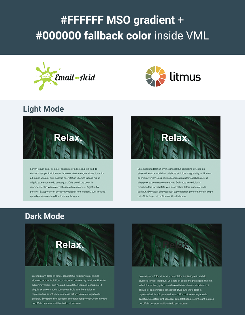   Since there are clearly different copies of the latest Outlook in circulation that are going to be doing two completely different things, it's no longer a viable fix for our issue. The Trouble With TextfillsThis discrepancy also seems to explain why another popular trick for trying to fix text in Outlook seems to work for some email developers and not for others. A popular suggestion is to use, for example, This solid textfill-fill doesn't get stripped off in Dark Mode like the gradients do, however there is also some major discrepancy between how it is interpreted inside VML across different copies of Outlook. As you can see below, when a black textfill is applied over a white VML fill, all copies of Outlook display it as a light grey in Dark Mode. However when you use a white textfill over a black VML shape, in Email on Acid, Testi and on my own PC, it actually shows up as very dark grey, whereas at Litmus is displays as a pale grey. 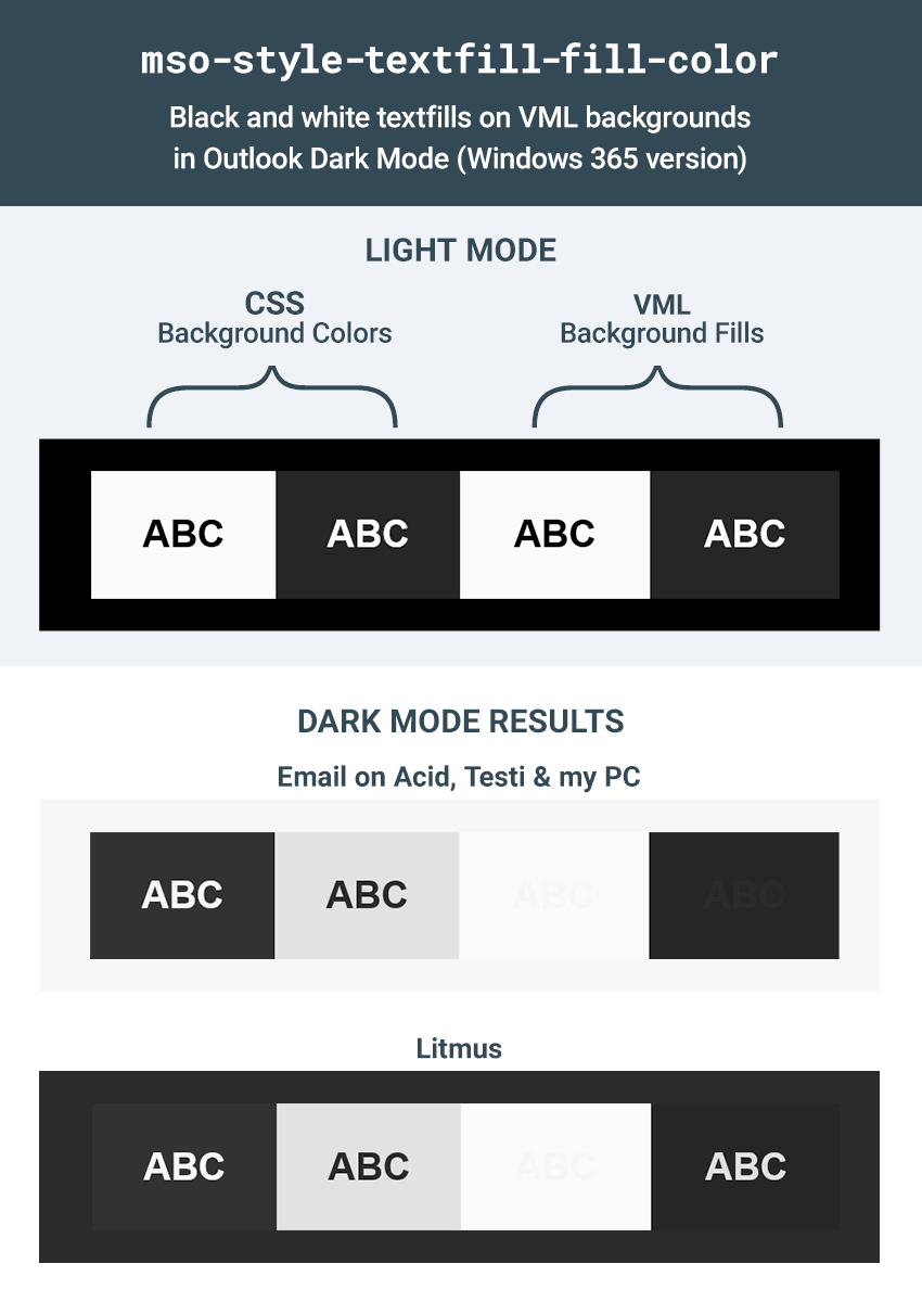   Similarly with colored textfills over VML, Email on Acid, Testi and my machine show a tendency to (mostly) darken the textfills, whereas the version at Litmus tends towards a lightening and desaturation.    Sadly I have no idea what is actually going on here, but at least we know we can completely rule out both A Way Around it AllOne way to avoid this difference in behaviour between text inside and outside VML is to use CSS positioning and z-index to layer your email content over the top of your VML content, keeping your text content separate from your VML. If this is viable for you, then it will mean you avoid the text being treated differently, and the However, that's not always possible, so what else can be done? An Experimental Solution for Inside VML: Harnessing the Power of |
| 9 Best AI Plugins for WordPress and WooCommerce for 2021 Posted: 29 Aug 2021 03:01 AM PDT Have you tried answering every question from every customer that comes to your website? How about making personalized real-time product suggestions to every customer on your website? Or suggestions about what to read next? While it is possible to do this manually, these tasks can all be better handled by computers with machine learning. Artificial intelligence allows computers to perform these tasks easily. You just have to give instructions and set parameters in AI-powered plugins for your WordPress website. AI and machine learning are now more accessible than ever, thanks to intuitive, smart plugins from CodeCanyon. What Is Artificial Intelligence?AI is used to improve our daily lives by making certain processes more efficient and allowing a computer to do complicated tasks automatically. Examples of this are automatic language translation apps like Algorithmia that can translate speech in one language into text in another language. Some everyday uses of artificial intelligence include:
   In this article, we'll look at AI-powered plugins for WordPress from CodeCanyon that will enable artificial intelligence and machine learning algorithms to elevate your business above its competitors. Best-Selling AI Plugins for WordPress in 2021Looking for the perfect AI-based plugin for your WordPress website? The AI revolution is here, and you don't want to get left behind. In 2021, make it your goal to integrate AI into your website and watch your business soar! You will find a great selection of premium AI plugins on CodeCanyon.    If you're still on the fence about integrating AI and machine learning into your business, here is what AI-powered plugins can do for your WordPress website:
AI Plugins for WordPress on CodeCanyonNow, let's review some of the top AI plugins for WordPress available on CodeCanyon. These premium AI-based plugins come at a very reasonable price. Each one can help your business use the power of artificial intelligence and machine learning by investing in customer engagement and satisfaction. 1. AI Chat Support Board   The Support Board plugin helps you automate your customers' communication with artificial-intelligence-driven bots and a chat system integrated with the most-used platforms. Save time and use the software you already know and love. Communicate with your customers directly in Slack. Connect Dialogflow and use rich messages on the fly. 2. Facebook Messenger Chat With Bot   Your customers can now receive answers instantly when you are not online. This plugin uses Facebook Messenger Bot API technology to build an intelligent bot for your WordPress website. 3. WooCommerce Dynamic Pricing and Discount With AI   Skip the strenuous manual process of configuring pricing and discounts. Instead, just use WooCommerce Dynamic Pricing and Discounts With AI. This comprehensive plugin has an elaborate pricing and discount toolkit that helps you customize the pricing structure on your WooCommerce store, implement different types of discount-based prices, and add coupons to any product or category. You can boost sales in your store with attractive festive and seasonal offers for returning customers based on their purchasing history. You can take advantage of Black Friday, set up end-of-the-season clearance sales, and much more. 4. WP AI Assistant   This unique WordPress plugin allows you to create a virtual AI-powered smart assistant on your website that visitors can engage with. WP AI Assistant will advise customers on purchase decisions, redirect them to specific pages, and even send discussions to admin by email. It is WPML-ready, so you can translate all your AI custom content. 5. Speaker: Page to Speech Plugin for WordPress   Speaker is a WordPress plugin designed to convert website page content into human-like speech. It converts text into human-like speech in more than 235 voices across 40+ languages and variants. It supports the standard of the Speech Synthesis Markup Language (SSML) that allows you to fine-tune speech for each article on your website. You can pause, intonate, and read numbers in the usual format for humans. 6. Voicer: Text to Speech Plugin for WordPress   Voiсer is a WordPress plugin designed to convert text into human-like speech. The basis of the plugin is the Google Cloud Platform, which ensures the reliability and speed of the plugin anywhere in the world. The Voicer WordPress plugin converts text into human-like speech in more than 200 voices across 30+ languages and variants. With this easy-to-use plugin, you can create lifelike interactions with your users and transform your customer service. 7. Innue: AI Chatbot With Facebook   Innue is the perfect chatbot for customer service or information acquisition. This intelligent interactive agent chatbot helps automate communication with the customer and create personalized customer experiences at scale. It can understand what a user wants and is prepared to meet users' requests. It can display all conversations, information, and menus on all devices, including desktops, tablets, and smartphones. 8. WooCommerce Chat Bot and Marketing App for Support Board   With this add-on for Support Board, you can now take conversational marketing to a whole new level via automated chatbots. People love communicating via chat because it's fast, easy, and actually feels like a conversation. Replace or enrich traditional marketing channels like emails and forms with the chatbot. Send discounts, follow-up messages, returning visitor messages, abandoned cart reminders, and cross-selling—all in a conversational way. 9. Maxbot: Chatbot Builder WordPress Plugin   Maxbot WordPress Chatbot Builder allows you to create a chatbot even when you have no coding knowledge. It's so easy to use. You can create different logic blocks and link them to respective triggers. Free AI Plugins for WordPressPremium AI-powered plugins for WordPress come with the most comprehensive set of features and can greatly boost the functionality of your website. But if your budget does not currently allow you to spend on these premium plugins, don't worry—I've put together a list of four free AI plugins with impressive free features. 1. EventAgent.ai   EventAgent.ai (E.ai) is the next generation in AI-driven online event calendars. E.ai learns from your organization and promotes your events for you with social network postings and promotional emails. E.ai is not just a calendar. It's a whole marketing department. 2. AI Content BotThis AI Content Plugin in WordPress allows you to create amazing human-like content snippets for your product or blog. You can create product descriptions and blog content, generate page headlines, rewrite and change the tone of sentences, and so on. 3. BotPenguin: AI Chatbot PlatformBotPenguin is an AI content plugin in WordPress that creates content snippets for your product or blog. You can create listicles, product descriptions, and blog outlines, rewrite and change the tone of your sentences, and so on. 4. ABtesting.ai: Landing Page Optimization   Automate your landing page A/B testing by using AI. The AI chooses the best combination of design, copy, and call to action. It chooses possible changes and tries them out by doing A/B testing to determine which ones have the best conversion rate. 5. Wootomation: Machine Learning AI   Wootomation uses machine learning AI to study sales on your website in order to suggest and recommend the best products to your customers, based on their cart items. The plugin adds an up-sell or cross-sale section in the cart before totals. The section suggests purchases based on what other people have also bought. How AI Can Improve Your WordPress Website1. Improves Customer Service and Increases SalesAutomated customer service offers the fast service that customers expect. Reduced waiting time and fast responses create a great user experience and a high rate of customer satisfaction that increases sales. 2. Enhanced ContentAI vastly improves the quality of your content and makes it easy to read. It does so by checking for spelling mistakes, grammar usage, and the style of your writing, and then suggesting ways to make your content fresh. 3. Boosts Your SEOAI performs tedious tasks that optimize your content SEO and improve search engine rankings. Some of these tasks include meta descriptions, tagging, and even adding 'alt text' to images 4. Personalized ExperienceAI can suggest articles to read, other products that go with what your customer is buying, and so on. Get an AI Plugin for Your Website Now!Don't miss out on this opportunity to move your business into the future of the web in 2021! High-quality, customer-focused, AI-powered plugins on CodeCanyon are very affordable and give your website the edge that is needed to succeed. |


| You are subscribed to email updates from Envato Tuts+ Tutorials. To stop receiving these emails, you may unsubscribe now. | Email delivery powered by Google |
| Google, 1600 Amphitheatre Parkway, Mountain View, CA 94043, United States | |


0 Comments